Foundation 5 Tabs
After upgrading the Foundation responsive css framework in a project I am currently working on I discovered that their tabs in version 5 don't come with any default styling.
For the context in which I am using these horizontal tabs this lack of traditional tab styling didn't give the user a clear indication of which tab is currently selected - particularly if there were only 2 tabs.
For example:
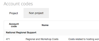
is the above showing the content for Projects or Non projects? I thought a more traditional tab format would better indicate this, eg.

Thanks to the great set up of this framework it was relatively easy to create an override for this. I have chosen the SASS setup option. I have a _custom-styles.scss file in the foundation/scss folder, and have added the last line below to foundation/scss/app.scss
Then it is just a matter of adding the following in _custom-styles.scss :
and recompiling the foundation css with "compass compile". If you are not using SASS you could just include the following in your own css override file:
For the context in which I am using these horizontal tabs this lack of traditional tab styling didn't give the user a clear indication of which tab is currently selected - particularly if there were only 2 tabs.
For example:

is the above showing the content for Projects or Non projects? I thought a more traditional tab format would better indicate this, eg.

Thanks to the great set up of this framework it was relatively easy to create an override for this. I have chosen the SASS setup option. I have a _custom-styles.scss file in the foundation/scss folder, and have added the last line below to foundation/scss/app.scss
@import "settings";
@import "foundation";
@import "custom-styles";
Then it is just a matter of adding the following in _custom-styles.scss :
dl.tabs {
    border-bottom: 1px solid #DDDDDD;
    padding-left: 5px;
}
.tabs {
    dd {
        border: 1px solid #DDDDDD;
        line-height: 1;
        margin-left: 5px;
        &.active {
            border-bottom-color:white !important;
        }
    }
}

.tabs-content {
    > .content {
        width: 100%;
    }
}
and recompiling the foundation css with "compass compile". If you are not using SASS you could just include the following in your own css override file:
dl.tabs {
    padding-left: 5px;
    border-bottom: 1px solid #DDDDDD;

}
.tabs dd{
    border: 1px solid #DDDDDD;
    line-height: 1;
    margin-left: 5px;
}
.tabs dd.active {

   border-bottom-color:white !important;
}
Comments
Post a Comment